The short answer
The design choices that convert best are about clarity, not decoration: a first screenshot that shows the result, a summary that names one job, a popup that works in one click, and a permission list short enough to read. Test one change at a time against your install rate.
- Your first screenshot is your homepage. Show the result.
- One job per summary line. Cut the feature list.
- Popups should do the core action in one click.
- Short permission lists feel safer at install.
Someone lands on your listing for about as long as it takes to sip coffee. In that time they decide whether your extension is the thing they were looking for. Design is mostly that sip, and it's one step in our Chrome extension development guide.
Where Chrome extension design ideas pay off first
| Surface | Weak version | Stronger version |
|---|---|---|
| First screenshot | Settings page | The result, on a real website |
| Summary line | "All-in-one productivity suite" | "Save any tab as a note in one click" |
| Icon | Detailed scene | One bold shape, readable at 16px |
| Popup | Tabs and menus | One main button, one status line |
| Permissions | Every site, by default | Only what the core job needs |
Show the result, not the menu. People install outcomes. Your settings page is proof of effort, not value.
The listing is the real landing page
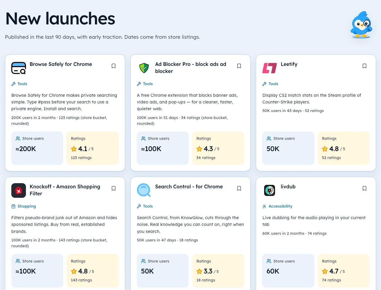
Most installs start on the listing, so treat it like a homepage. Lead with the before-and-after, then a second screenshot for the second-best feature, and stop there if you can. The wording around it is the job of Chrome Web Store SEO. Google's listing metrics docs show how to track what each change does.
You can check these figures on the Art & Design category page, each with the day we saw it.
Popups: one click or bust
A popup isn't a mini website. It's a remote control.
- Put the core action at the top.
- Show state in words: "Saved", "Paused on this site".
- Move settings to an options page.
If the main action needs a scroll, the popup is too big.
Permissions are part of the design
The install prompt is a screen you didn't draw but still own. Each extra permission adds a line of warning text.
Icons that read at 16 pixels
The icon shows up at several sizes, but the toolbar version is tiny. Chrome's extension docs list the sizes to provide.
- One bold shape, not a scene.
- High contrast against both light and dark toolbars.
- No text, unless it's a single letter.
- A distinct colour from the big tools users already have pinned.
Test it by pinning the extension next to five others. If you can't find yours in a second, simplify.
The first-run screen
What happens right after install shapes the first review. Many extensions open nothing, and users forget them. Others open a long tour that people close.
A short welcome page works better. Show one thing to try, with a button that does it. If the extension needs a permission or a sign-in, ask here, and say why in one line.
| First-run choice | Effect |
|---|---|
| Nothing opens | Users forget it exists |
| Long feature tour | Users skip it |
| One clear action | Users see the value right away |
| Sign-in wall | Many leave before trying |
Our guide to the Featured badge notes that Google also looks for core features that work without extra sign-in.
Options pages that don't overwhelm
Settings belong on an options page, not in the popup. Keep it short, group related settings, and use plain labels.
- Defaults that work for nearly everyone, so few need to visit.
- One page, with headings, not a maze of tabs.
- Save automatically, and say "Saved" when it does.
- An undo or reset for each section.
If a setting is only used by a handful of people, consider whether it needs to exist at all.
Accessibility and dark mode
Good design works for everyone. A few habits cover most cases.
- Keyboard accessto every button in the popup.
- Labels on icon buttons, so screen readers can announce them.
- Enough contrastbetween text and background.
- Respect the system theme, light or dark.
These also tend to lift ratings, since frustrated users are the ones who leave low stars. You can see how well-rated tools in your space look on our niche pages, each listing with its rating and the date we checked.
Screenshots, one by one
The store shows several screenshots. Each slot has a job.
| Slot | Job | Common mistake |
|---|---|---|
| First | Show the result on a real page | A settings screen |
| Second | Show the second-best feature | Repeating the first |
| Third | Show how easy it is, like one click | A crowded diagram |
| Fourth and on | Edge cases, themes, options | Text-heavy marketing slides |
Bigger listings use more screenshots. In our 3 Oct 2026 crawl, 65.6% of extensions with 1,000,000+ users showed three or more, against 45.6% of those under 1,000. That's a correlation, not proof, but three good screenshots cost little.
Copy is design too
The words on the listing and in the popup shape how the tool feels. A few rules keep them clear.
- Name the job in plain words. "Save tabs" beats "session orchestration".
- Use the user's words, taken from reviews of similar tools.
- Label buttons with verbs: "Save", "Copy", "Export".
- Write states plainly: "Saved 3 tabs", "Paused on this site".
Our guide to keyword research shows how to find the phrases people actually use.
Testing a design change
Design changes are guesses until you measure them. Keep tests simple.
- Change one thing, like the first screenshot.
- Wait two weeksso day-to-day noise evens out.
- Compare install ratefrom listing views in your dashboard.
- Keep or revert, and write down what you learned.
Changing five things at once tells you nothing about which one worked. You can study how well-rated tools in your space present themselves on our categories pages, each listing with its rating and the date we checked.
Small touches that feel alive
- A badge count that updates as you use it.
- A tiny confirmation animation on save.
- A friendly empty state instead of a blank box.
- Keyboard shortcuts listed where people look.
We're biased, but it helps to look at the best-rated tools in your niche before redesigning. Note what their first screenshot shows, then do the opposite of whatever the low-rated ones do.
Then check the install rate. That's the sip of coffee, measured.
Questions people ask
What makes a good Chrome extension design?
It does one job fast, looks native next to Chrome, and explains itself without a tutorial.
How big should a Chrome extension popup be?
Small enough to read at a glance. If users need to scroll for the main action, it's too much.
Do screenshots affect installs?
They're the main thing people see on your listing. Track install rate from impressions in your developer dashboard after any change.
What size should a Chrome extension icon be?
Chrome's docs ask for several sizes, including 16, 32, 48 and 128 pixels. Design for the 16 pixel version first, since that's what sits in the toolbar.
Should my extension support dark mode?
If it shows any interface, yes. Many people browse in dark mode, and a bright white popup at night feels broken.
What changed
- Refreshed rating counts to our 3 Oct 2026 crawl and added sections on icons, the first-run screen, options pages, accessibility and dark mode.
Where these numbers come from
- developer.chrome.comChrome Web Store: Analyze your store listing metricsAccessed 3 Oct 2026
Part of our guide: Chrome Extension Development Guide for Founders: 5 Steps. More in Build and launch.
129 new extensions in the last 30 days in Art & Design. See them all.
Start from a niche with proven demand instead of a blank page. Updated 3 Oct 2026 from our Chrome Web Store crawl